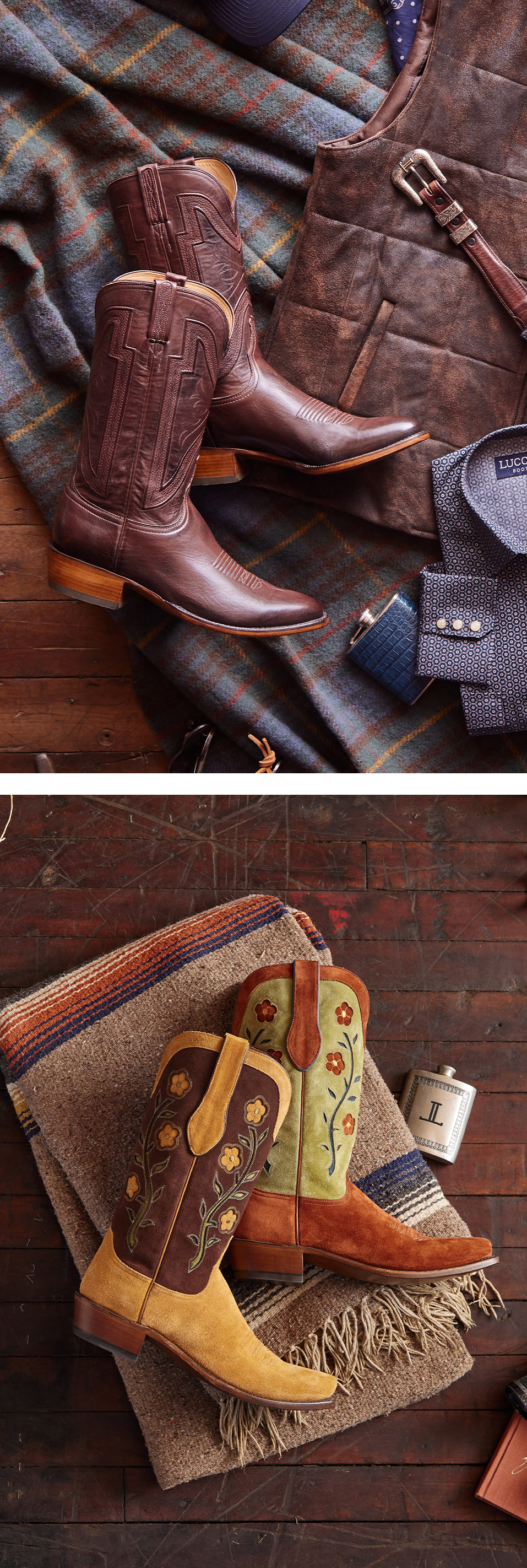
Lucchese Bootmaker | Michaels | Tuesday Morning
BEFORE

AFTER
Using elements from two separate images, I created a single, cohesive visual that showcased the desired product more clearly. The final image looks natural and intentional—like it was captured in one perfect shot.

BEFORE

AFTER
Wrinkles and folds in the bedding were carefully smoothed to create a crisp, freshly made appearance, while subtle lighting and color adjustments helped maintain texture and tone. The final result presents a more refined, brand-aligned visual ready for use in high-end marketing.
BEFORE
AFTER
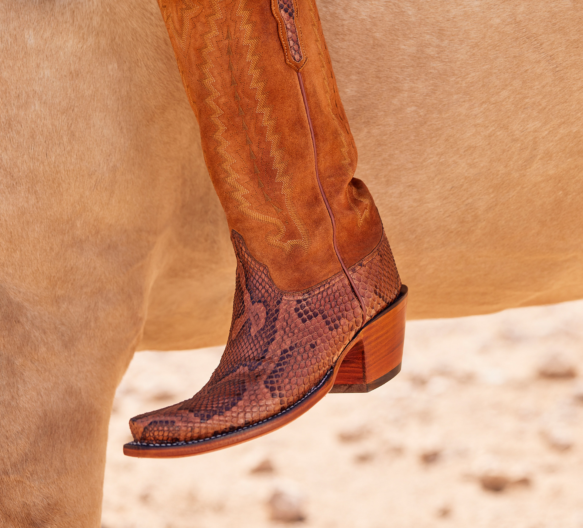
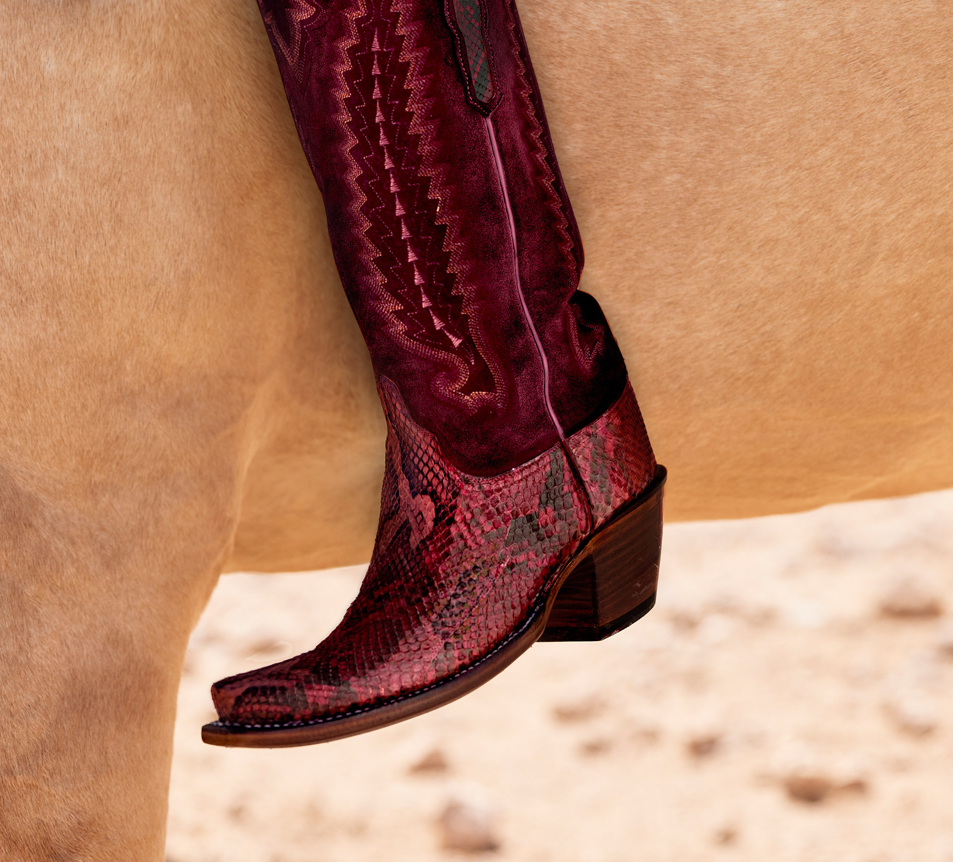
The original boot color wasn’t available, but the image still needed to sell the product. I transformed it into something that didn’t exist—yet looked like it always had. With careful adjustments to tone and texture, I aligned the visual with an in-stock material, preserving realism without ever picking up a camera.
BEFORE |. AFTER

BEFORE |. AFTER
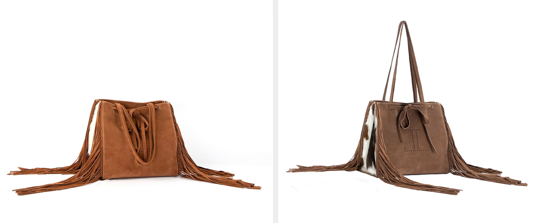
The original image was clean but misleading—wrong color, missing a major feature, and falling short of the product’s true appeal. I reshaped it into something accurate and intentional, adjusting tone, revealing key details, and turning a flat photo into a story worth clicking on.
What looked like a simple fix required precision and restraint. When boots weren’t photographed perfectly straight, I corrected alignment without distorting stitchwork, toe shape, or material patterns—subtle adjustments that preserved craftsmanship and made the difference between almost right and just right.
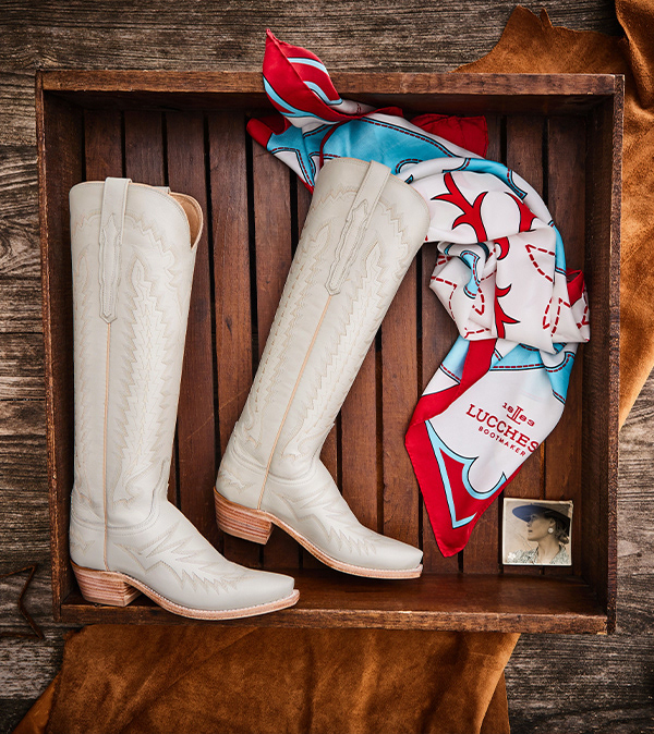
BEFORE
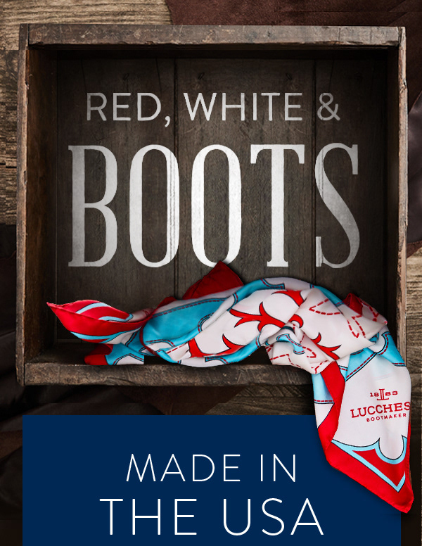
AFTER
The original photo featured a full product flat lay—but the story needed focus. I removed the boots, re-styled the scarf, and transformed the setting into a bold, graphic composition built around typography. What started as a product shot became a brand-forward moment—clean, confident, and ready to headline a campaign.